A quick check and there are sites that state, for example:
Numerous empirical observations and models of the global climate confirm the hypothesis that global warming enhances the global hydrologic cycle. For instance, a global warming by 4°C (7.2°F) is expected to increase global precipitation by about 10 percent. Models suggest that the increase is more likely to come as heavier rainfall, rather than as more frequent rainfalls or falls of longer duration.Well that is pretty definitive, and so let us, using the same procedure as last week, see if in fact this hypothesis is true.
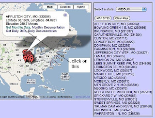
And, to make my life (and yours if you are following along) easier I am going to use the structure of the spreadsheet that I created last week, and merely, where possible, replace the temperature data with annual precipitation data from the same set of weather stations. To get the precipitation information I step through the same sequence from the United States Historical Climatology Network to get to the station sites for Missouri, which if you will remember, gets me to this map.

As before I will step down through the list of weather stations that are given for the state to get the data that I need. After clicking on the name of the station (and again I will use Appleton City as the example) I already have the station data entered from last time, so all I need to do is click on the “Get Monthly Data” phrase.
Now, when I get to the Monthly data page I now scroll down to the bottom of the page, where I can see the following selection:

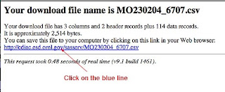
As before this will take you to a screen that gives you the file name that has been created,

And when you click the blue line, then a file is downloaded to your computer. As before if you open the file, then you get the list of annual precipitation for the site since 1895.

Returning to the spreadsheet with all the stations on it, I now paste that column of data into the table, starting in square C13. As before I continue doing this, until I have all the precipitation data from the USHCN weather stations (all 26).
In contrast with the temperature data I don’t know where to go to get the precipitation data for Missouri from GISS – a visit to their site notes that they get their information from the Climate Research Unit at the University of East Anglia – and given the current kerfuffle over there, I am going to give trying to get info from them a pass. Still we have the information from the last 114 years for Missouri, based on 26 stations.
I already have the average for those stations set up from when I created the original spreadsheet (though I have to change the data ranges for the plots). And now I can check the hypothesis that we started with. Given the reported increase in global temperature, has there been an increase in precipitation in Missouri?

Well if one looks there has been a very small, and statistically insignificant, increase in precipitation over the last 114 years, so it appears that the Diane Sawyer hypothesis is incorrect.
To explain the “statistically insignificant” remark, I am going to give a relatively simple explanation that I found here of the meaning of the r-squared values that I put on every graph, to show how significant the trend is
The main result of a correlation is called the correlation coefficient (or "r"). It ranges from -1.0 to +1.0. The closer r is to +1 or -1, the more closely the two variables are related.To show where the significant variable is for the state data, lets look at the change in precipitation with latitude (r-squared is 0.82):
If r is close to 0, it means there is no relationship between the variables. If r is positive, it means that as one variable gets larger the other gets larger. If r is negative it means that as one gets larger, the other gets smaller (often called an "inverse" correlation).
While correlation coefficients are normally reported as r = (a value between -1 and +1), squaring them makes then easier to understand. The square of the coefficient (or r square) is equal to the percent of the variation in one variable that is related to the variation in the other. After squaring r, ignore the decimal point. An r of .5 means 25% of the variation is related (.5 squared =.25). An r value of .7 means 49% of the variance is related (.7 squared = .49).

Still nothing significant with longitude, but it is interesting to revisit (since the plots were already set up) the questions I posed last time on data scatter, and population. I had hypothesized that (based on Anthony Watts evaluation of weather stations) the scatter in the measure of the data (as identified by the standard deviation) would get worse over time. It did not for temperatures in Missouri – possibly because it might be tied to rates of temperature change, and Missouri hasn't seen one - but also that could have been because of the change in thermometers. Here is the plot for precipitation:

Well there is a trend, if not a very significant one, which gives a little scientific credence to Anthony Watts for the state of Missouri. And does population size have an impact?

I was going to leave that without comment, but I suspect that the apparent correlation has more to do with where folk live in regard to latitude, than the actual size of the population, but to validate the relationship would require a lot more data than I have input to date.
Now you may say that what I have posted today really has little relevance, since Missouri has had an insignificant amount of warming over the past 114 years but the moisture that Missouri sees (and feels in the rain and snow) is largely generated elsewhere, and so if there is a correlation, given the relatively large amount of precipitation the state gets, then it should show up, or should it?
The reason I ask the last question is that if you go to GISS you will find this plot:

Now (I checked) there is no real correlation between Missouri precipitation and that which is global, but the conclusions regarding changing rates are the same. I quote NOAA :
Globally-averaged land-based precipitation shows a statistically insignificant upward trend with most of the increase occurring in the first half of the 20th century.
So I am afraid it is not just Missouri data but also global data that falsifies the “Sawyer” hypothesis.
0 comments:
Post a Comment