Now, if you are going to analyze data it is a good idea to define what the questions are that you are seeking an answer to before you start. So let me state 3 initial hypotheses. The first is from Jones et al in 2007, which refers back to a paper by Karl and James in 1990, which says, in part
If the Canadian stations behave similarly to stations in the United States, the decrease of the DTR (diurnal temperature range) may be exaggerated by about 0.1 dg C due to urbanization.This correlates with the 2007 paper which says
Urban-related warming over China is shown to be about 0.1°C/ decade over the period 1951–2004, with true climatic warming accounting for 0.81°C over this period.So the hypothesis is that the rate of warming does not significantly change, as a function of the size of the community around the weather station.
The second comes from the way in which the Goddard Institute for Space Sciences classifies site sizes, calling communities below 10,000 rural. So the hypothesis is that there is no change in temperature with population below a community size of 10,000.
And the third hypothesis comes from reading Anthony Watts, and it seems to me that if his finding about the deteriorating condition of weather stations holds true, then the scatter of the data should get worse with time. So my hypothesis is that the standard deviation of the results should increase with time.
OK so I have my hypotheses – where do I get my data (you also need to have a spread sheet program, I am going to use Microsoft Excel running on a Mac) and a state map (or equivalent source for town populations). As I said I am going to look at the data for Missouri, but before I get the data I need a table to put it into. So I open Excel and create the table I want. To do this I first type titles starting in square B3, and going sequentially down, inserting the titles Station; GISS; USHCN Code; Latitude; Longitude; Elevation; and Population. I then move to square A11, and type in Calendar Year. So we start with a table that looks like this:
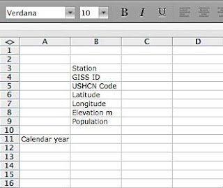
I am going to be putting data in from 1895 to the year 2008, and so I put 1895 into square A12, and then (=A12+1) into square A13. Then I highlight from A13 to A125 and select “Fill down” from the EDIT menu at the top of the Excel page. This now puts the years to 2008 into the A column. So now I need to get the data to put into the table. To get this I go to the US Historical Climatology Network and select Missouri from the scrolling list on the top left of the page.
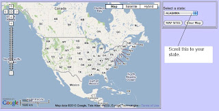
I then clicked on the Map Sites button to get to the data that I wanted.
The map that now comes up shows the 26 sites that are listed for which there are records going back to 1895 in Missouri. These are listed to the right, and if you click on any one of them then the identification for it shows on the main map. I have done that for the first site on the list, Appleton City, so that you can see what I mean.
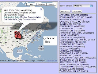
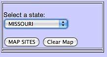
From the map information I can get the USHCN Code (230204), the latitude, longitude and elevation of the site. So I can enter those below that station name in my table, which now looks like this:
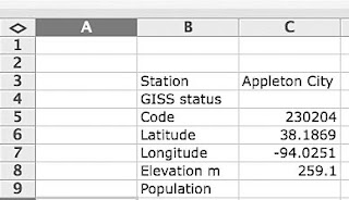
Now I need the historic temperature data for that site, and to get this I click on the “Get Monthly Data” phrase in the map balloon. This takes me to a new window.
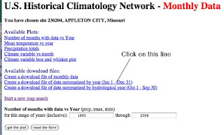
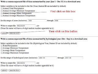
We need to have the data in a form that will fit into the EXCEL spreadsheet, so click on the middle line in the second set of options, to create a download file. This drops you down to the bottom half of the page, and what we want (for today) is the Annual Average Mean Temperature, which is on the upper half of the screen, so I click on that box (a tick mark appears). Then I press on the submit button.
This brings up a response, which tells you the name of the file that will be downloaded to your computer, when you click the blue line, which I did.
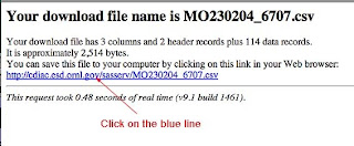
This is the data that you want from the file (and why I included the site number when I made the table, so that I could check that I was getting each range copied into the right column, and that when I was finished I had data from all the sites). The file is downloaded into your downloads file on your computer, and when you open it in EXCEL, you get:
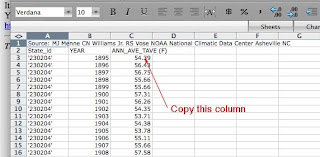
The data that you want is in the third column (C ) and you want to make sure that you have the Annual Average Temp so C2 should read as shown. Copy the numbers in the column (Select C3 to C116 and copy or command C). Then re-open the initial EXCEL page where we are storing the data (I call mine Missouri Annual Temp, so I will refer to it as the MAT page from now on). Place the cursor on box C13 and tell the computer to Paste (either from the Edit menu or by using command V). You should get the data pasted into the spreadsheet, as I have shown.
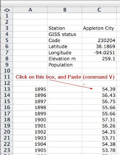
This is the information for the first site, and should fill down to C126. It is now a good idea to save the file.
Now we go back to the USHCN page, close the window that had the data file on it, and you should be looking at the map and list of sites again. Now select the second name on the list (in this case Bowling Green) and repeat the steps to input the site information to the spreadsheet, then select Monthly Data, and the Annual Average Mean Temperature, download the file and copy the information, and then paste it into the spreadsheet.
Keep doing this as you work down the list of stations and by the end you should have 26 station records (if you are doing Missouri – the numbers vary – Illinois has 36 for example). The right end of the EXCEL file now looks like this (except that I have put in some information in boxes W4 and Y4 that I will explain in a minute).
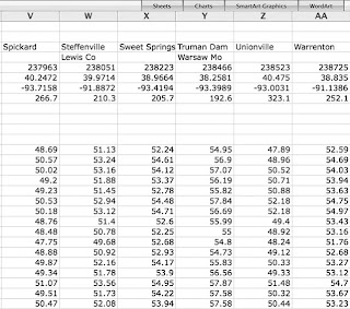 (and the files extend down to row 126).
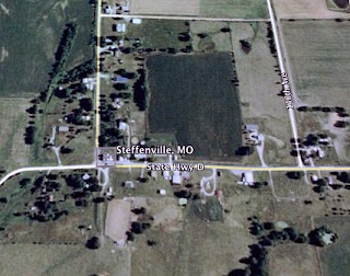
 Now I need the information on population, and for that I went to the State Map (since it has it all in one place), and by each town there is the population from the 2000 Census). So I then inserted this set of numbers as I moved along row 9. I had a problem when I got to Steffenville, since no population is shown. So I went to Google Earth and had a look at the place. It looks as though there is perhaps a dozen or so houses there, so I gave it a population of 30, and for Truman Dam, looking it up on Google, the Corps of Engineers Office is in Web City, so I used the population of that town for the station.
Now I’m not quite done getting data, since the Goddard Institute for Space Studies, GISS, actually doesn’t use any of these, but uses information from three of the largest cities in the state, Columbia, Springfield and Saint Louis. So I need to get the data that they use, but since they record the data in degrees C, and the rest are in degrees F, I don’t want to put their data right next to the information in the table, so while I create the station names, and put them in boxes AC3, AD4 and AE4 I am going to create the initial data columns further over in the table (actually in columns AN, AO and AP) so that after I insert the numbers I can convert them back to Farenheit.
So where do I get the GISS temperatures? Unfortunately I have forgotten the exact route I used, but you can start with the GISTEMP Station Selector page and if you click on the shape of Missouri on the map
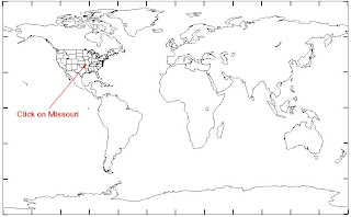
You will get a list of the stations that they have in Missouri, though, as I said above, apparently they only use 3 of them - in part because some of the other series are not complete. (I am only going to show the top of the list down past Columbia. ) You click on the name of the station you want (we are going to use the three listed above, so the procedure is the same for each from this point).
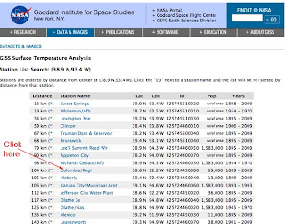
Clicking on the station, at GISS, gives you a plot of the average temperature over the past , but you need to go one step further and click on the bottom phrase of those shown to get to the data page. Oh, and it is this page, with the populations that are less than 10,000 being considered as rural, that gave rise to the second hypothesis that we are testing. (Which I guess you might call the “and is James Hansen right?” corollary to the initial question I asked).
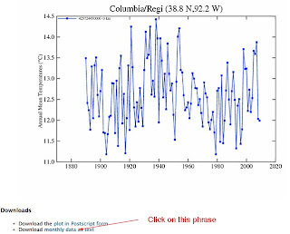
And being their usual helpful selves this is not easily downloadable into our table. So, having no other way to proceed, I hand-downloaded the info that I wanted into the table. I have only shown the top of the table, and the numbers that I want started out in the column on the far end, but, as I explain below, I changed the array (If you are doing this, the table can be stretched so that all the data for one year are on a single line, and then you need the data in the far right column). So the data that I am inserting in a column, starting in box AN13 is the metANN (mean temperature Annual) data. (Small hint, to check that I had the years and data correct I squeezed the frame down so that the row data for a year appeared in 2 rows with the metANN in the second row one column over, as shown, and I started with 1895 (12.05) to be consistent with the other tabulated values. (And I only copied the left half of the screen that contains what I need).
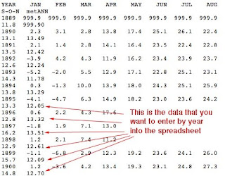
This took a little while, since the data had to be hand entered for all three sites, but after maybe an hour (remember I titled this a day as a climate scientist – this is why), we have the data from the three sites that GISS uses in Missouri entered into the table, in Centigrade. The latitude and longitude aren’t given quite as precisely, we don’t have heights, and the population values don’t match the census, but this is the GISS data, and we gratefully take what we are given.
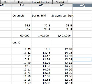
Now we need to go over to the initial columns for these stations (AC to AE) and insert the same data, converted to deg F. (so box AC13 has the equation = 32+(AN13*9/5)). Then I filled down from AC13 to AC126, and then filled right AC to AE, and the conversion was done). In the new columns I also entered the 2000 census data for the three sites, rather than the GISS values.
Now I have the raw data that I need to do the analysis. As they say most research is in the preparation, the fun part comes a lot more rapidly. To get to that we need to add just a few calculation steps into the raw data table. The first one that I am going to add is to simply take three different sets of averages. The first is for each year for the USHCN data without the GISS stations, the second is each year for the GISS stations, and the third is for each station over the full period of the data set. (I am not going to show the screens for this since they are rather straightforward.)
To get the first average I go to column AG – call it Historic ave, without GISS) and in AG13 type =SUM(C13:AB13)/26 which calculates the average or mean value. Then I select from AG13 to AG126 and fill down from the EDIT menu. That gives me the average annual temp for the USHCN data. Then I add, in column AH, which I call Standard Deviation, and in box AH13 a statistical formula (that I get from the Insert menu > Function > STDEV ). This puts =STDEV() into the box, and I give it the range I want examined by either selecting all the boxes from C13 to AE13. Or typing that in, so that the box reads =STDEV(C13:AE13) and click ENTER. This gives me a measure of the scatter in the data for the year 1895. I then select the boxes AH13 to AH126 and filled down. This now has tabulated the change in the scatter of the data over the last 113 years. (And I’ll come back to this in a minute).
Now I want the average of the GISS stations, so I created this in column AJ, typing the formula =(AC13+AD13+AE13)/3 into that box. Then, as before, selecting and filling down the column. And then there is a final column – which I call Difference, which is the difference between the Historic data set and the GISS set. That is created in column AL, and is simply typed into AL13 as =AJ13 – AG13, then filled down to AL129. (It is extended to include the average values that are calculated next). And to provide the overall average for the state I combined all 29 station data into a combined average in column AF.
And the individual station averages are created by typing =sum(c13:C126)/114 into box C129, and then filling that right to column AG129. This formula can then be copied and pasted into box AJ129 to give the average value over the years for the stations that GISS relies on. And immediately it is clear, by looking at box AL129 that there is an average difference, over the years, of 1.19 deg F between the stations that GISS are using, which are in the larger cities, and those of the more rural stations in Missouri. (Which would seem to validate the criticism from E.M. Smith, but that, as they used to say in debate, “is not the question before the house.”)
Now you are going to have to take my word for this, but when I started making this data set I had no knowledge as to how it would turn out, though I had some expectations. Let us now see what happens when we plot the data. (I am going to use the charting function of EXCEL, and add trendlines to the data, with equations and the r-squared value, so that we can see what is happening, since the data is scattered about a bit on each individual plot).
So the first hypothesis we wanted to verify was - the rate of warming does not significantly change, as a function of the size of the community around the weather station. Given that the historic average is for smaller stations and the GISS average is for the larger communities, this would, initially suggest that a plot of difference against time should show no change, if this hypothesis is true.
(Plot of column AL against A)
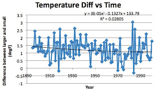
Well this shows that the difference has been getting less, rather than increasing – which, if anything I suppose initially supports the hypothesis. But out of curiosity I wondered how much temperature change we have had, since the actual relationship hypothesized was about rates of change. So let’s plot average temperature against time.
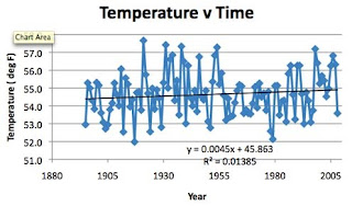
Now if you look at that plot Missouri has had quite a wimpy warming, less than half a degree F over a hundred and fifteen years, so given that small range, detecting changes in the rates is perhaps not feasible. But let’s plot the difference as a function of temperature just to see if there is anything.
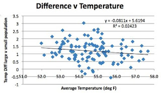
And still it goes down? Wonder if that is trying to tell us something?
Moving on to the second hypothesis, which comes from GISS, and is that temperature is insensitive to adjacent population below a community size of 10,000 folk. This is a plot of row 129 plotted against row 9. I am going to show the plot twice. The first time I am using a log scale for the horizontal axis to cover the range from a population of 30 to that of over a million.
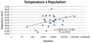
And now I am going to change the scale so that the horizontal scale is linear, and truncate it so that it only shows the data up to a population of 50,000.
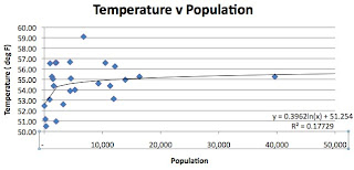
Notice how the temperature is much more sensitive to population BELOW a population of 10,000 relative to the sensitivity above that size. Thus the assumption that GISS makes in classifying every town below 10,000 as rural without any sensitivity to population is clearly not correct.
And interestingly this also possibly explains the decline in the temperature difference with time (although it would require inputting data from earlier years census to fully explore the topic). The assumption behind the first two hypotheses was that the larger towns had a greater sensitivity to urban heat, which is getting worse, but in reality, if the smaller towns were growing faster (and require less population change to have an impact on the measured temperature) then they would be gaining temperature, because of that growth, faster than the urban sites – hence the negative slope to the graph.
Which brings me to my hypothesis that the scatter in the data would get larger with time, given the deterioration and urbanization around the weather stations. By using standard deviation to illustrate scatter, the plot, if I am right should have an upward slope, over time.
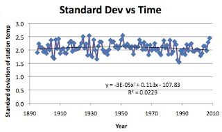
Hmm! Well it looks as though I got that wrong – it was heading the way I thought until the 1940’s and then it started to bend the other way. Apparently the change from glass thermometers to the automated Maximum/Minimum Temperature System (MMTS) started about then and the changing shape of the curve is perhaps indicative of the spread of the new system.
In all these graphs it should be borne in mind that Missouri has had a relatively stable climate over the past hundred and fifteen years or so. There are also likely influences across the state due to changes in latitude and longitude. And since, with the data table assembled, generating additional plots is easy and relatively fast, we can take a look. It turns out that Longitude doesn’t have that much effect, but the temperature values are much more sensitive to Latitude than anything else that we have discussed.

And it may well be that dependence that hides some of the nuances of the other relationships.
Well there we are, a little exercise in climate science. Of the three hypotheses we looked into, it turned out that the second and third were wrong, and because of that it may be that the data on which the first was based was not focused sufficiently on the changes in the small size of some of the communities (if the sensitivity gets less above a town size of perhaps 15,000.
The procedures that I spelled out in such detail should allow anyone else to run this same series of steps to determine if what I found for Missouri holds true over other states in the Union, and if anyone wants a copy of the spreadsheet, let me know where to send it through comments. (While yes I work at a University and yes I acquire data, I have no clue how to store it on the master servers –all of ours, for lots of good reasons, are stored otherwise, and so I don’t know how to make the file available in other ways than by attaching it to an e-mail).
And so to summarize the exercise, which as I noted in the title took me about a day to do and write up – by analyzing the data from 29 weather stations in Missouri, which have a continuous record of temperature from 1895 to 2008 (and are still running I assume) we have shown that
a) It is not possible to decide if Anthony Watts or Phil Jones is correct, since there may have been an incorrect assumption made in the data collection, which (conclusion b) means that the wrong initial assumptions were made in parsing the data.
b) The assumption that the “urban heat island” effect gets greater with larger conurbations is not correct in Missouri, where the data suggests that the sensitivity is most critical as the community grows to a size of 15,000 people.
c) The hypothesis that the data scatter gets worse with time because of deterioration in station conditions does not hold in Missouri, when the assumption is predicated on increase in the standard deviation of the readout between stations in a community. However this assumption may have been valid where reliance was placed on glass thermometers, since it is possible that the change to automated instrumentation has, at least for the present, over-ridden that deterioration.
So much for my venture into climate science, at least for now. I just wanted to show that it is not that difficult to check things out for yourself, and, provided you have the time, it can yield some unexpected results. (Though I should point out that Anthony Watts and Joseph D’Aleo quoted Oke in their report on surface temperature records, (page 34)
Oke (1973) * found that the urban heat-island (in °C) increases according to the formula –It is interesting to note that his coefficient is 0.317 and the one I found is 0.396.
➢ Urban heat-island warming = 0.317 ln P, where P = population.
Thus a village with a population of 10 has a warm bias of 0.73°C. A village with 100 has a warm bias of 1.46°C and a town with a population of 1000 people has a warm bias of 2.2°C. A large city with a million people has a warm bias of 4.4°C.
Which is the other thing that you learn when doing research, most of the time someone else has been there before you, and there is little that is new, under the sun.
* Oke, T.R. 1973. City size and the urban heat island. Atmospheric Environment 7: 769-779.
0 comments:
Post a Comment