So first let us look at the Global Warming situation. It has received very little coverage in the United States, and barely rated a mention in the UK, but the recent release of a new plot of global temperatures by the Climate Research Unit (CRU) at the University of East Anglia (UEA) is worth putting up, purely as a matter of record.
Figure 1. Global average temperatures over the past 15 years (British Daily Mail ).
This Met Office release (on a Friday) has largely been ignored by a scientific community that only exists in its current form as long as the reality that this graph presents remains ignored.
There was an immediate controversy in the UK (but not here, where it remains largely unknown) and there was a follow up report the following Sunday. But, even while ignored, the lack of increase in global temperature over the past fifteen years is surely some indication that the models widely used to predict an exponentially increasing global temperature, are falsified.
So what can a good alarmist do? Well consider the headline in the St. Louis Post Dispatch on November 26th. “2012 so far the warmest year on record in parts of Missouri.” So let me talk about this for a minute. Notice that this does not say that the entire state is at its warmest. Rather it reports that Jayson Gosselin of the National Weather Service has noted that this was the warmest year on record for St. Louis and Columbia.
The average temperature in St. Louis so far this year is 63.4 degrees, a full degree higher than the 62.4-degree average seen in the previous warmest year, 1921. In Columbia, the previous warmest year as of Nov. 24 was in 1938, when the average was 61 degrees. This year, the average is 61.7 degrees. In Kansas City, Mo., it has been the fourth warmest year on record so far, with an average temperature of 61.3 degrees, Gosselin said.He goes on to be more specific about when the heat wave occurred (in case we missed it!)
Gosselin, who works in the Weather Service's office near St. Louis, said the "meteorological spring" _ March through May _ was far and away the warmest ever in St. Louis with an average temperature of 61.1 degrees. Second warmest was 1910, when the average was 57.5 for the spring months. Summer also was unusually warm. Average temperatures in March, May and July all set records in St. Louis, he said.For those who forget, I took a look at the Missouri State Temperatures first back in February 2010, when I first became curious as to whether our state was showing the global warming that everyone was talking about.
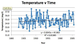
I found the location of all the US Historical Climate Network sites for Missouri and determined their location (latitude and longitude) elevation and population. Now as it turns out that there are 26 stations in Missouri, and so I took the average temperature for each station each year (this was the “homogenized” temperature in that initial post) and was able to plot the average state temperature over time.

Figure 2. Average “USHCN homogenized” temperatures for the state of Missouri (USHCN)
And if you look at that plot the state temperature has barely risen (less than half a degree Fahrenheit in 115 years) since official temperatures have been recorded, and the hottest years were in the 1930’s in the dust bowl years.
But there was something missing from the data table and it turns out that three of the largest cities in the state, Columbia, Springfield, and St. Louis were not tabulated in this network, but are, instead, part of the Goddard Institute for Space Studies (GISS) network that Dr. James Hansen used for his work.
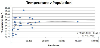
And, being further curious, I then combined the two sets of data and obtained a plot for temperature as a function of population.

Figure 3. Temperature as a function of population size around the station. This conclusion, that there is a log relationship is not new. To quote from that post:
Oke (1973) * found that the urban heat-island (in °C) increases according to the formula –It is interesting to note that his coefficient is 0.317 and the one I found is 0.396.
➢ Urban heat-island warming = 0.317 ln P, where P = population.
Thus a village with a population of 10 has a warm bias of 0.73°C. A village with 100 has a warm bias of 1.46°C and a town with a population of 1000 people has a warm bias of 2.2°C. A large city with a million people has a warm bias of 4.4°C.
( * Oke, T.R. 1973. City size and the urban heat island. Atmospheric Environment 7: 769-779.)
But then I revisited the state later in time, after the USHCN started also providing the raw and Time of Observation Corrected data (TOBS). And I found a few more interesting facts.
Firstly I compared the difference between the GISS data for the three large cities with the state average temperatures for both the raw data, and the “homogenized” data.

Figure 4. Difference between the average temperature in the large cities, and that of the average temperature in the State. The blue line is for the homogenized data, the red is for the raw.
I then went on to compare the TOBS average to that of the largest cities and this is what I got:

Figure 5. Difference between the average temperature in the large cities of the state, and that of the average temperature in the state using the TOBS data. A slight upward trend, but not that significant. As for the temperatures in Missouri, over the past 100 years, with the correction – really there is no trend, it has been relatively stable:

Figure 6. Average TOBS temperature for the state of Missouri over the recorded interval. I did note that the highest temperatures were some decades ago.
Oh and the correlation with population held up with the TOBS data, the coefficient was 0.327, and the r^2 value was 0.14.
Now I finished the entire contiguous United States some time ago, and that temperature relationship to population held up quite well, as the individual state reports listed on the rhs side of the blog show.
So what do we learn from this? That alarmist rhetoric is continuing with an embarrassing lack (for those of us who are scientists) of balance in the reporting. Data now has to be carefully cherry-picked to still be able to convey the message that the world is warming. One wonders how long they will be able to get away with this before they are called out by more prominent folk?

0 comments:
Post a Comment