 Changes in the temperatures in the Pacific that are described as El Niño and La Niña events.(NOAA)
One of the increasingly obvious drivers for the weather we’re likely to see over the next year comes from the relative state of the temperatures of the Pacific Ocean. This is generally known as the El Niño effect when the waters are warmer, and La Niña when they are cooler than normal, as shown above. Collectively it is the Oceanic Niño Index (ONI). The effect, over the past 60 years, can be compared with the regional temperatures over that period, derived in an earlier post. Remember that the regional plots were artificially adjusted to move vertically and allow the changes in shape.
 A comparison of average station temperatures in the Pacific states (red), mountain states, (dark green), Midwest (light green) and the Atlantic States (purple) with the plots separated by block change in the temperature values for each region, and compared to the Pacific Oceanic Niño Index (ONI) the lower blue filled in line.
 The relative importance of the ONI to temperatures in different parts of the world, and particularly Texas, and the derivation of the plot follows.
Considering the volumes of water that are involved, the relative changes in temperatures are quite significant. Consider the current situation, where as we head into a La Niña winter, the temperatures across the Pacific are as much as 1 deg C below normal.
 Temperature variations from the average across the Pacific (Australia is in the lower left, the USA on the upper right). (NOAA )
 There is a growing recognition that the impact of these changes controls the monsoons in India, going back to the paper published in Science back in 2006 by Kumar et al. This paper explained why monsoon failure always happened with El Niño events, but not all El Niño events led to monsoons. There are thus “flavors” to the events and their results depending on whether they happen in the winter or the summer. The typical impacts, globally, are shown with these illustrations, showing how the timing has influence:
First El Niño:
 The changing influence of an El Niño event, depending on timing (after Kumar et al)
 India only becomes dry in the second of the two cases, with the monsoon months occurring between June and the end of August, i.e. the lower condition. (And there is also an Arizona Monsoon which might be one of the few areas of the US to be immediately impacted in that case).
With La Niña, the conditions change, and with the event occurring in the summer India gets the needed rain.
 The impacts of a La Niña event, depending on timing (after Kumar et al )
 The condition that we are moving into at the present is the upper of these latter two pictures, which is not good news for the folk in Texas who have been hoping for rain. NOAA is now predicting that the drought will last into the summer and high temperatures will continue through 2012.
 Temperature projections for the next year (NOAA
  Precipitation projections for the next year (NOAA )
 The impact of these events can, therefore be quite severe. However there is a continual swing from one condition to the other, hence the more broad description of the event that has come into vogue, that of the El Niño Southern Oscillation, or ENSO, or more generally the Oceanic Nino Index (ONI) And the United States sees different impacts in different regions of the country. For example consider the contrast between conditions for the East Coast:
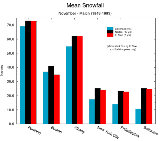 Change in snowfall on the East Coast as a result of ENSO (NOAA)
 Change in snowfall in the West as a result of ENSO (NOAA )
 There has been some debate in the blogosphere as to what effect this has all had on the US temperatures. Well there are a couple of different points that have to be considered in that discussion, that seem to have got lost in some of the “religious” aspects of the extreme ends of the debate. It has been partially blamed for the high global temperatures in 1998. However, if we take just the last 60 years of data, we can look at how those data fit with the plots that I have previously posted to the site on regional temperatures.
 The ONI plot from 1950 (GGWeather )
 Now how does this look relative to the temperature changes that have occurred in the US. There are a couple of things to bear in mind on this, that seem lost to the folk at Real Climate. The first is this graphic, which seems to have got lost from the view of most of those who looked at the recent release of pre-papers from the BEST study.
 Map of stations in and near the United States with at least 70 years of measurements; red stations are those with positive trends and blue stations are those with negative trends. (The BEST Project).
The second point is the change in temperature profiles (which BEST does not look at, rather concentrating on individual results) for the different regions of the US.
 Average variation in time for four regions of the country, with the results adjusted as shown to separate the curves, and show them in order (bottom to top) from West to East.
Using the section of the above plot the regional temperatures were separated, by adding and subtracting from the actual temperatures (as shown in the legend to the above) to get a separation, the section after 1950 can be used to make the comparison.
The ONI plot can now be superimposed below this, with the amplitudes of roughly the same size (since one is in Centigrade and the other in Fahrenheit). The result shows that the ONI (lowered filled blue plot) has some influence on the Western Coast temperature (the lowest red curve), but as one moves through the Mountain states (dark green(, and less on the Midwest (lighter green), with the effects smoothed out by the time they reach the Atlantic Coast (upper purple). The fall in temperature along the Atlantic Coast is emphasized with this plot, and clearly nothing to do with what is happening in the Pacific.
A comparison of average station temperatures in the Pacific states (red), mountain states, (dark green), Midwest (light green) and the Atlantic States (purple) with the plots separated by block change in the temperature values for each region, and compared to the Pacific Oceanic Niño Index (ONI) the lower blue filled in line. Now rumor has it that something similar happens in the Atlantic?
0 comments:
Post a Comment