Having obtained both the mean temperatures after homogenization of the data, and the TOBS (Time of Observation corrected) data for these 24 stations it is time to find the GISS stations. According to Chiefio the three stations that GISS relies on for information on PA include Philladelphia, Wilkes-Barre and Pittsburgh. So going over to the Goddard Institute for Space Studies (GISS) web page I find Pittsburgh with no problem. For Philadelphia there are two stations available, but since one has only data from 1962 to 1993, I’ll use the other – though it only has data from 1947. It is, after all, listed as Philadelphia USA. And then Wilkes Barre has also only data from 1949.
Putting in the population data there was a little search confusion between Pleasant Mount, (pop 1,022) and Mount Pleasant (pop 4,369). Other than that the entry of data was relatively straightforward, and so on to what it revealed. Looking at the difference between the GISS data and that from the USHCN, when I use the homogenized data, (which I plot in purple) then the difference between the GISS data and the homogenized data reduces with time.

Interestingly, however, while this trend is down, when the original raw data, corrected only for time of observation (The TOBS data) is plotted, the trends are the other way. (TOBS plots use a green line).

Which leads into the next comparison, which is the plot of actual average state temperature, first with the homogenized data set:

Using the homogenized data set (which is the one that feeds into other analyses) this shows that the state temperature has been increasing by roughly 1.5 degF over a hundred years. If, however, I plot the TOBS data then a different rate is seen. The graph shows the much less worrisome rate of 0.5 deg per hundred years.

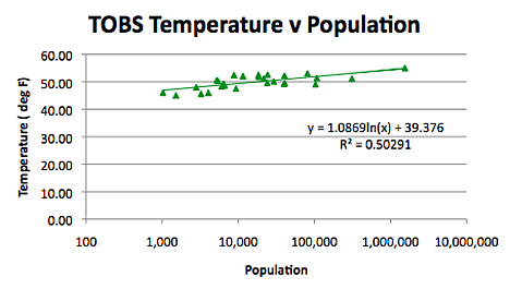
Turning to the geographical effects on temperature within the state, I will plot only the TOBS data for these. This is partly because the homogenization of the data tends to reduce these effects, as a side effect of the averaging process that they use, but also because both sets are quite close.

With homogenization the R^2 value drops to 0.39, and the gradient (trend) to -2.65.
The correlation with longitude shows relatively poor values in both cases.

In contrast there is the strong correlation with elevation that we have come to expect.

Although, and this is a little surprise, the correlation remains equivalent with the homogenized data, and the trend about the same. (-0.0172).
The final correlation, that of population, has been getting poorer as I have moved East from Missouri, but in the second surprise, it is very strong in PA.
Which, given the correlations found West of Missouri, leaves me wondering what the confounding factors were in Indiana and Ohio?
And having discussed this indirectly in the opening plots of the post, it should come as no surprise when as a final plot, I subtracted the raw TOBS data from the homogenized set, and got a steadily rising change over the course of the time period.

Maybe I should do more of these?
0 comments:
Post a Comment