When I began I had some little idea of what I might find but in the main did not want to prejudge the issue. But thought it would be fun to make the odd hypothesis and then see if the data sustained it. So far I have covered about ten states, they are listed at the very bottom of the column to the right. However, as I was writing up the information for Indiana I found that the data being presented at the US Historical Climate Network (USHCN), had changed. The data that I had been using in the reviews to that point had been adjusted before being posted, as I noted:
However, note that a subset of GHCN, the United States Historical Climatology Network (USHCN), has been adjusted via a homogenization intended to remove urban warming and other artifacts [Karl et al., 1990; Peterson and Vose, 1997].Since one of the things that I was finding was that there remained an urban size effect in the data, even after homogenization, and that I did not know what the “other artifacts” were, it would have been nice to have access to the raw data. Well that information is now available. I did not use it, at the time I wrote the post about Indiana, since there are significant gaps in the data table provided. However, for today’s post I have gone back to Missouri, to see if the conclusions change, when raw data is used instead of homogenized.
Basically what I have done, to make my life easier was to duplicate the Missouri data table, which I described forming back in the original post I then acquired the data for the RAW mean temperatures, as I described for the Indiana post, and just pasted them into the table over the original data. Doing it this way meant that the curves were already set up, and did not have to be created again.
Then, because I want to be able to plot information from the two sets of data to seen what the differences are, I copied the entire data sheet containing the RAW data, and pasted it as a second sheet in the Excel file containing the original homogenized data. So that is where we start our investigation for the day.
The first set of values that I had looked at in the original post was to see if there was a difference between the stations that GISS is using for Missouri, and those for the more numerous and distributed stations in the USHCN. There has been some criticism that the reduction in station numbers by GISS (recognized at their site) would bias the results that they are reporting. To see if this was the case I subtracted the average temperature for the USHCN stations from the average of the 3 GISS stations and plotted the result. That result showed that the difference between the two was slightly reducing over time, implying that the criticism, for the Missouri data, was, perhaps unfounded. This was the original plot:
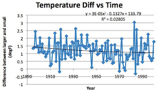
I now shrink the size of the individual data points, and add the same set of averaged difference between the values per year from Sheet 2 – the RAW data. (Ed. note - I will use a red color for the raw data and blue/purple for the homogenized values). And this is what I get:

Now this second curve (with equation etc to the right) shows a much stronger correlation of temp diff with time, and that, starting in about 1970 that the temperature of the GISS stations rose much more rapidly than the USHCN stations, which is the suspicion that Chiefio had expressed. This is, however, only one state and we will see what happens as we progress through the rest.
Looking at the actual temperatures over the century the curves are slightly more significantly changed. In the old plot (with homogenized data) we found:
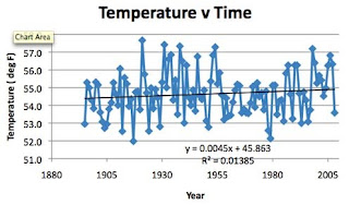
With the RAW data, however, the plot is a little different:

Instead of there being a steady (though minor) rise in temperature over time, there is a slight decline – not particularly statistically significant, but on the other hand significant in that the “homogenization” of the data takes a negative trend in the RAW data and adjusts it the other way.
There are, in fact sufficient differences between the two sets of curves that the initial conclusions are not as strongly supported by the raw data. That, at this stage, is merely just worth noting since, for this sort of topic there is a need for much more data before stronger conclusions can be drawn. And so we will work back through the states, noting how the differences in data change the conclusions. And perhaps, after a while, there will be enough information to start to draw stronger conclusions.
But for now I am going to finish this by posting the original plots derived from the “normalized” data with the raw data graphs set below them (with the addition of the longitude graph that I did not show the first time).
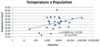
Moving on to the second hypothesis, which comes from GISS, and is that temperature is insensitive to adjacent population below a community size of 10,000 folk. This is a plot of row 129 plotted against row 9. I am going to show the plot twice. The first time I am using a log scale for the horizontal axis to cover the range from a population of 30 to that of over a million.
And now I am going to change the scale so that the horizontal scale is linear, and truncate it so that it only shows the data up to a population of 50,000.
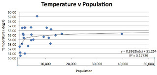
Notice how the temperature is much more sensitive to population BELOW a population of 10,000 relative to the sensitivity above that size. Thus the assumption that GISS makes in classifying every town below 10,000 as rural without any sensitivity to population is clearly not correct. That was my original conclusion – here is the data plot when the raw data was used:

Not quite as impressive a correlation, but again the scatter in the data and the form of the regression is still evident, so the conclusion stands, albeit more weakly.
I commented earlier that interestingly this also possibly explains the decline in the temperature difference with time (although it would require inputting data from earlier years census to fully explore the topic). The assumption behind the first two hypotheses was that the larger towns had a greater sensitivity to urban heat, which is getting worse, but in reality, if the smaller towns were growing faster (and require less population change to have an impact on the measured temperature) then they would be gaining temperature, because of that growth, faster than the urban sites – hence the negative slope to the graph. Given that the slope is now changed this thought (while worth remembering as we go to larger data sets is now not substantiated by the raw data analysis)
Which brings me to my hypothesis that the scatter in the data would get larger with time, given the deterioration and urbanization around the weather stations. By using standard deviation to illustrate scatter, the plot, if I am right should have an upward slope, over time.
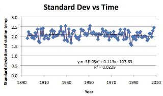
Hmm! Well it looks as though I got that wrong – it was heading the way I thought until the 1940’s and then it started to bend the other way. Apparently the change from glass thermometers to the automated Maximum/Minimum Temperature System (MMTS) started about then and the changing shape of the curve is perhaps indicative of the spread of the new system. And that conclusion hasn’t changed.

In all these graphs it should be borne in mind that Missouri has had a relatively stable climate over the past hundred and fifteen years or so.
There are also likely influences across the state due to changes in latitude and longitude. And since, with the data table assembled, generating additional plots is easy and relatively fast, we can take a look. Originally I said “ It turns out that Longitude doesn’t have that much effect, but the temperature values are much more sensitive to Latitude than anything else that we have discussed.” Based on these curves:

And

Now when the raw data is plotted, the scatter is reduced, but there are, consistently a couple of outlying data points that influence the correlation. So these are the raw data plots for Latitude and Longitude.


And I’ll add a final plot to the set that wasn’t in the original, but later proved important (and explained some of the longitudinal variation) that of elevation, though this is a relatively flat state.

So with some rather muddy results to start with, off we go on our trek again.
0 comments:
Post a Comment